MBS Mohammed Baobaid
All projects
Project
University project Data Analytics Created 29 April 2026 at 10:39 AM

Interactive Business Analytics Dashboard

An R Shiny dashboard where I turned a retail customer-experience workbook into a no-code exploration tool for managers.

Created 29 April 2026 at 10:39 AM, this BANA482 case study was my interactive business analytics dashboard project. I built it as if I were handing a real retail manager a practical tool: upload an Excel workbook, inspect the data, compare customer-experience metrics, and leave with defensible questions for the next operating meeting.

R R Shiny readxl dplyr ggplot2 DT tidyr scales shinythemes Excel Descriptive analytics Data quality audit Interactive dashboards
Narrated walkthrough

This audio is not a word-for-word copy of the case below. You can read the written case while listening to me explain the project in more detail.

0:00 / 0:00
Speed
Interactive Business Analytics Dashboard project preview
180 Transactions
20 Variables
63 Missing cells
21 pts NPS gap

Role

Dashboard developer, business analyst, and report author

Outcome

I built a manager-facing Shiny application around 180 retail transactions, 20 variables, 7 numeric measures, and 12 categorical fields. The dashboard surfaced 63 missing cells, showed a 21-point NPS gap between in-store and phone channels, and identified Electronics and Beauty as the highest complaint-risk categories.

The Challenge

The assignment was not only to summarize a spreadsheet. The real challenge was to make a mixed retail customer-experience workbook usable by people who may not write R, SQL, or formulas. The data had numeric measures, categorical business fields, structural missing values, complaint text, loyalty tiers, and a title row above the headers. I needed the dashboard to feel forgiving, transparent, and useful under realistic spreadsheet conditions.

The Approach

I treated the project as a business-facing analytics product. I built the Shiny app around the manager workflow: load the workbook, detect the worksheet structure, audit missing values, classify variables, explore numeric and categorical summaries, compare metrics by segment, plot patterns, and keep the raw data visible for trust. I then validated the output against Excel pivots and independent base R summaries so the dashboard was not just interactive, but auditable.

How it works

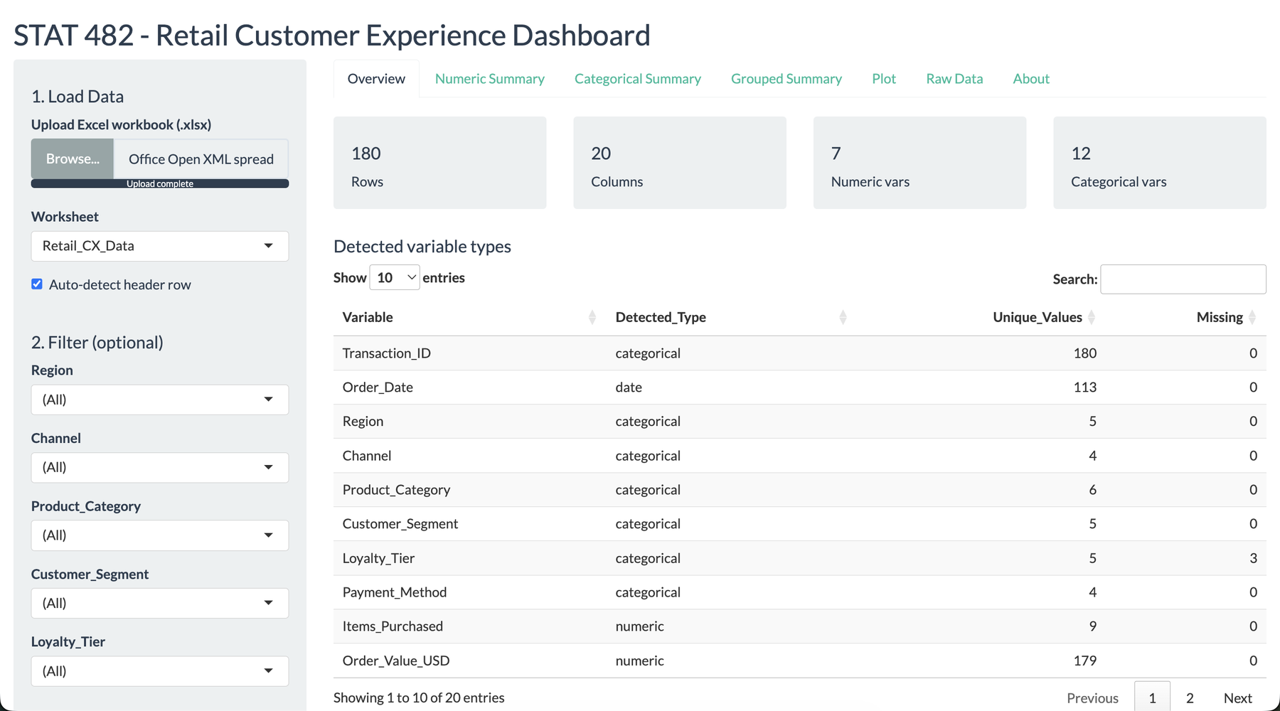
I built the dashboard around a manager workflow

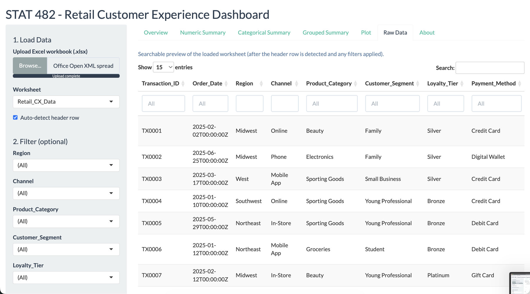
I wanted this project to feel like a tool a store manager could actually open during a review meeting. The opening screen summarizes the uploaded workbook, identifies the detected variable types, and gives immediate confidence that the data was read correctly. That mattered to me because the dashboard was not meant to impress with code first. It was meant to reduce the distance between a messy workbook and a useful decision.

Overview tab of the Shiny retail customer experience dashboard with workbook controls and KPI cards
The overview gives managers a fast sense of rows, columns, numeric variables, categorical variables, and detected field types.

I made data loading resilient instead of fragile

The workbook had a title row above the actual headers, which is common in business spreadsheets. I wrote the app to detect the likely header row instead of assuming that the first row was always clean. Users can also choose the worksheet and adjust skipped rows manually. This design choice made the dashboard more realistic: it expects spreadsheets to be human-made, not perfectly database-shaped.

I surfaced data quality before analysis

Before I let users interpret charts, I made the dashboard show what might weaken the analysis. Wait_Time_Min had 54 missing values because wait time does not apply to every channel. Complaint_Theme was missing in most rows because most transactions did not have complaints. Loyalty_Tier had only three missing values. Treating these cases differently was important because missingness is not always the same kind of problem.

Dashboard missing-values audit showing variable-level missing counts and percentages
The missing-value audit separates structural missingness from fields that may need cleanup or follow-up.

I made the numeric summaries auditable

The numeric summary tab gives the basic statistics a manager expects: count, missing values, mean, median, standard deviation, quartiles, minimum, and maximum. I included both mean and median because customer metrics can be skewed, especially order value and NPS. I validated these summaries against independent calculations so the table could be trusted as an analytical baseline.

Numeric summary table with missing values, means, medians, quartiles, and ranges
The numeric summary turns mixed customer-experience data into a transparent statistical baseline.

I treated categorical patterns as business questions

The categorical summary tab helped me move from columns to business questions. Region, channel, product category, customer segment, loyalty tier, complaint flag, return flag, and sentiment label are not just labels. They are ways managers organize action. By showing frequencies and percentages, the dashboard makes it easier to see where customers, complaints, or transactions are concentrated.

Categorical frequency table for customer-experience fields such as region, channel, and loyalty tier
Frequency tables make categorical structure visible before moving into comparisons or charts.

I let managers compare metrics by segment

The grouped summary tab is where the dashboard becomes diagnostic. A user can compare a numeric metric such as order value, satisfaction, discount rate, wait time, or NPS across a categorical grouping such as region, channel, loyalty tier, or product category. This is how I found the practical findings: Phone had the weakest NPS, and Electronics and Beauty carried the highest complaint rates.

Grouped summary table comparing numeric retail metrics by business segment
Grouped summaries let managers compare performance without writing formulas or code.

I added custom exploration without asking users to code

The plot tab lets users choose variables and generate charts directly. Numeric variables become histograms, categorical variables become bar charts, and optional grouping makes the chart more diagnostic. I included this because a dashboard should not only answer the questions I already know. It should help managers ask the next question while they are looking at the data.

Custom plot builder tab with variable selectors and a generated chart
The plot builder gives non-technical users a controlled way to explore the workbook.
Grouped plot showing a customer-experience metric by region
Grouped plots make regional and channel differences easier to inspect visually.

I kept the raw data visible and searchable

I did not want the dashboard to become a black box. The raw-data tab keeps the filtered rows visible through a searchable table. This matters when a manager wants to sanity-check an outlier, inspect a complaint, or confirm that a filter is doing what they expect. The ability to move from chart to row-level evidence is a small feature, but it builds trust.

Searchable raw data preview table inside the Shiny dashboard
The raw-data preview keeps the analysis traceable back to the underlying transactions.

What this project says about how I work

This case is personal to me because it shows how I like to combine analytics and product thinking. I did not only calculate summary statistics. I asked who would use the dashboard, what they would trust, where they might make a wrong assumption, and how the interface could guide them toward better questions. The result is an academic case study, but the mindset is practical: make the analysis usable, transparent, and honest about its limits.

Results

  • The workbook contained 180 retail customer-experience transactions across 20 variables.
  • The dashboard classified 7 numeric variables and 12 categorical variables, with Transaction_ID treated as a categorical identifier.
  • The missing-value audit found 63 missing cells, including 54 missing Wait_Time_Min values that were structural for non-store channels.
  • Order value varied by region, with Southeast averaging $122.54 and Southwest averaging $109.05, but the within-region variation was large enough that I avoided overclaiming the difference.
  • NPS by channel produced the clearest operational finding: In-Store averaged about 33, while Phone averaged about 11, creating a roughly 21-point gap.
  • Complaint rates were highest in Electronics at 40.9% and Beauty at 37.1%, compared with a portfolio average near 26%.
  • Satisfaction by loyalty tier was not cleanly monotonic, which showed that loyalty tier alone was not a strong explanation for customer satisfaction.
  • The dashboard output was validated against Excel pivots and independent R summaries before I converted the findings into recommendations.

Key features

01 Excel workbook upload with worksheet selection
02 Automatic header-row detection for messy business spreadsheets
03 Automatic numeric, categorical, date, and text variable classification
04 Numeric summary tables with missing counts, mean, median, standard deviation, quartiles, and range
05 Categorical frequency tables with explicit missing-value visibility
06 Grouped summaries for comparing numeric metrics across business segments
07 Custom histogram and bar-chart builder for no-code exploration
08 Searchable raw-data preview so users can validate what the dashboard is summarizing
09 Sidebar filters for region, channel, product category, customer segment, and loyalty tier

Tech stack

R R Shiny readxl dplyr ggplot2 DT tidyr scales shinythemes Excel Descriptive analytics Data quality audit Interactive dashboards
Project links

Interested in similar work?

I build systems like this for teams that need reliable engineering, clean interfaces, and measurable outcomes.