MBS Mohammed Baobaid
All projects
Project
University project Data Analytics Created 3 March 2026 at 1:52 PM

Retail Performance Analytics

A Tableau case study where I analyzed Sample Superstore sales, profit, discounting, region, and product performance to test whether revenue growth was creating sustainable profit.

Created 3 March 2026 at 1:52 PM, this BANA482 case study was my Tableau-centered retail analytics project. I used the Sample Superstore dataset to move beyond basic sales reporting and ask a sharper management question: were stronger sales actually translating into reliable profitability?

Tableau Tableau calculated fields Interactive dashboards Retail analytics Profitability analysis Discount analysis Geographic analysis Product ranking CSV PowerPoint Microsoft Word
Narrated walkthrough

This audio is not a word-for-word copy of the case below. You can read the written case while listening to me explain the project in more detail.

0:00 / 0:00
Speed
Retail Performance Analytics project preview
$2.30M Sales
$286K Profit
12.47% Profit ratio
9,994 Records

Role

Lead retail analytics storyteller and Tableau dashboard builder

Outcome

I analyzed 9,994 order-line records, measured $2.30M in total sales, $286K in total profit, and a 12.47% profit ratio, then turned the findings into three executive dashboards and a profitability-focused strategy.

The Challenge

The business question was not simply whether the retailer was selling more. The deeper question was whether those sales were producing stable profit. The Sample Superstore data showed revenue growth, but profit moved with more volatility. I needed to identify where margin quality was strong, where it was weak, and which dashboard views would help a manager act on the pattern.

The Approach

I structured the work as a Tableau visual analytics workflow. I validated the order-line dataset, created calculated fields such as Profit Ratio, built time-series and profitability views, compared categories and customer segments, examined discount impact, mapped regional performance, and used dynamic product rankings to connect the analysis to portfolio decisions.

How it works

I started with the margin question

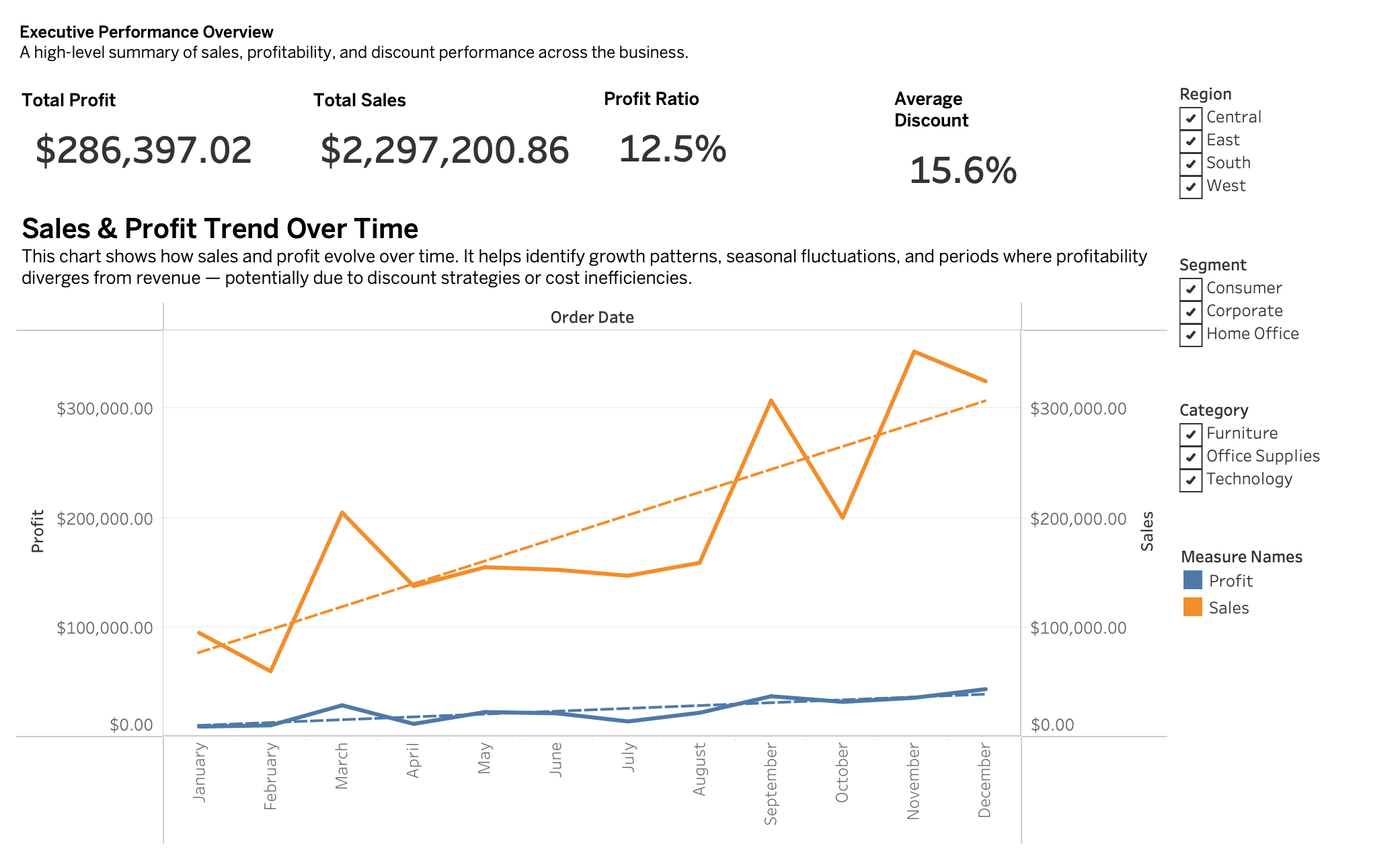
I framed the project around a question that executives actually care about: are stronger sales creating sustainable profit? The dataset had enough revenue growth to look encouraging at first glance, but the profit trend was less stable. That tension became the center of the analysis and kept the case from becoming a generic sales dashboard.

I treated the dataset as order-line evidence

The Sample Superstore file contained 9,994 order-line records and 21 variables, including order dates, customer segments, regions, categories, sub-categories, discounts, sales, and profit. I preserved the order-line level because the business questions depended on product, discount, and regional detail. This also let the Tableau workbook support multiple levels of aggregation without losing operational context.

I built the executive view first

The first dashboard summarizes the business in one place: total sales, total profit, profit ratio, average discount, and sales-profit movement over time. I wanted the opening view to make the main tension visible immediately. Sales reached $2.30M and profit reached $286K, but the trend chart shows why revenue alone is not enough to judge performance.

Executive Tableau dashboard with total sales, profit, profit ratio, average discount, and trend lines
The executive overview shows the gap between revenue growth and profit stability.

I separated profitable growth from weak revenue

The category view made the first structural issue clear. Technology generated $145,454.95 in profit, while Office Supplies produced $122,490.80. Furniture, despite being a major revenue category, produced only $18,451.27 in profit. That difference changed the recommendation: the business should not simply push every category equally, because categories do not convert sales into margin at the same rate.

I made discount risk visible

Discounting was the most important warning signal in the case. Across the full dataset, average discount was 15.6%, but high-discount records were destructive to margin. Records with 40% to 59% discounts had a -25.47% profit ratio, and records with 60% to 100% discounts had a -119.2% profit ratio. The dashboard translates that into a practical management rule: discounts need thresholds, not just campaign enthusiasm.

Tableau profitability drivers dashboard with category profit, segment profit, discount impact, and regional heatmap
The profitability dashboard connects category mix, segment contribution, discount behavior, and regional product performance.

I looked at geography as a performance system

Regional analysis showed that performance was not evenly distributed. The West region led profit at $108,418.45 and a 14.94% margin, while Central delivered $39,706.36 and only a 7.92% margin. State-level and regional product views helped move the discussion from national averages to local decisions: product emphasis, pricing, and discount controls should differ by market.

Tableau geographic and product insights dashboard with state map and product rankings
The regional dashboard highlights geographic concentration and connects product rankings to profitability context.

I used product ranking without letting sales mislead me

The dynamic Top N and Bottom N product views were useful because they combined sales ranking with profitability color. A high-sales product is not automatically a good product if it has weak margin, and a low-sales product is not automatically a problem if it serves a profitable niche. This part of the case helped me present product portfolio decisions with more nuance.

I turned the findings into management actions

The recommendations followed directly from the dashboards: reduce aggressive discounting, protect margins with approval thresholds, prioritize Technology, review Furniture pricing and cost structure, retain the Consumer segment, and use regional strategies rather than one national playbook. I also recommended that dashboards emphasize Profit Ratio alongside Sales so performance conversations do not reward volume at the expense of margin.

What this project says about how I work

This project pushed me to act like both analyst and decision translator. I did the dashboarding work, but I also had to decide which charts deserved executive attention and which findings should become strategy. The final case is personal to me because it shows the way I like to use BI: not as decoration, but as a structured argument about what the business should do next.

Results

  • The dataset contained 9,994 order-line records, 5,009 orders, 793 customers, and 1,862 products across 2014 to 2017.
  • Total sales reached $2,297,200.86 and total profit reached $286,397.02, producing a 12.47% overall profit ratio.
  • Annual sales increased from $484,247.50 in 2014 to $733,215.26 in 2017, but yearly profit did not rise proportionally.
  • Technology produced the strongest category profit at $145,454.95, while Furniture produced only $18,451.27 and a 2.49% category margin.
  • The Consumer segment generated the largest absolute profit at $134,119.21.
  • The West region led profit at $108,418.45, while Central lagged at $39,706.36 and a 7.92% margin.
  • High discounts were a clear margin risk: records with 40% to 59% discounts produced a -25.47% profit ratio, and records with 60% to 100% discounts produced a -119.2% profit ratio.

Key features

01 Built an executive dashboard for sales, profit, profit ratio, average discount, and time trends
02 Designed profitability-driver views across product category, customer segment, discount, and region
03 Created regional and product dashboards with state maps and top/bottom product rankings
04 Engineered Tableau calculated fields including profit ratio and time dimensions
05 Used dynamic Top N and Bottom N product ranking logic
06 Connected visual findings to discount, category, segment, and regional strategy
07 Separated sales growth from margin quality so the recommendations were not revenue-only

Tech stack

Tableau Tableau calculated fields Interactive dashboards Retail analytics Profitability analysis Discount analysis Geographic analysis Product ranking CSV PowerPoint Microsoft Word
Project links

Interested in similar work?

I build systems like this for teams that need reliable engineering, clean interfaces, and measurable outcomes.